2024 · Sense
Hiring through messaging
I rearchitected Sense Messaging across mobile and desktop after a design system pilot exposed foundational usability problems the old UI had been hiding. What began as a reskin became a rebuild for recruiters, hiring managers and candidates.
- Role
- Lead Product Designer
- Team
- PM, design system designer, junior designer, 2 engineering managers, 4 engineers
- Timeline
- 8 months
- Tools
- Figma, FigJam, in-product survey
Overview
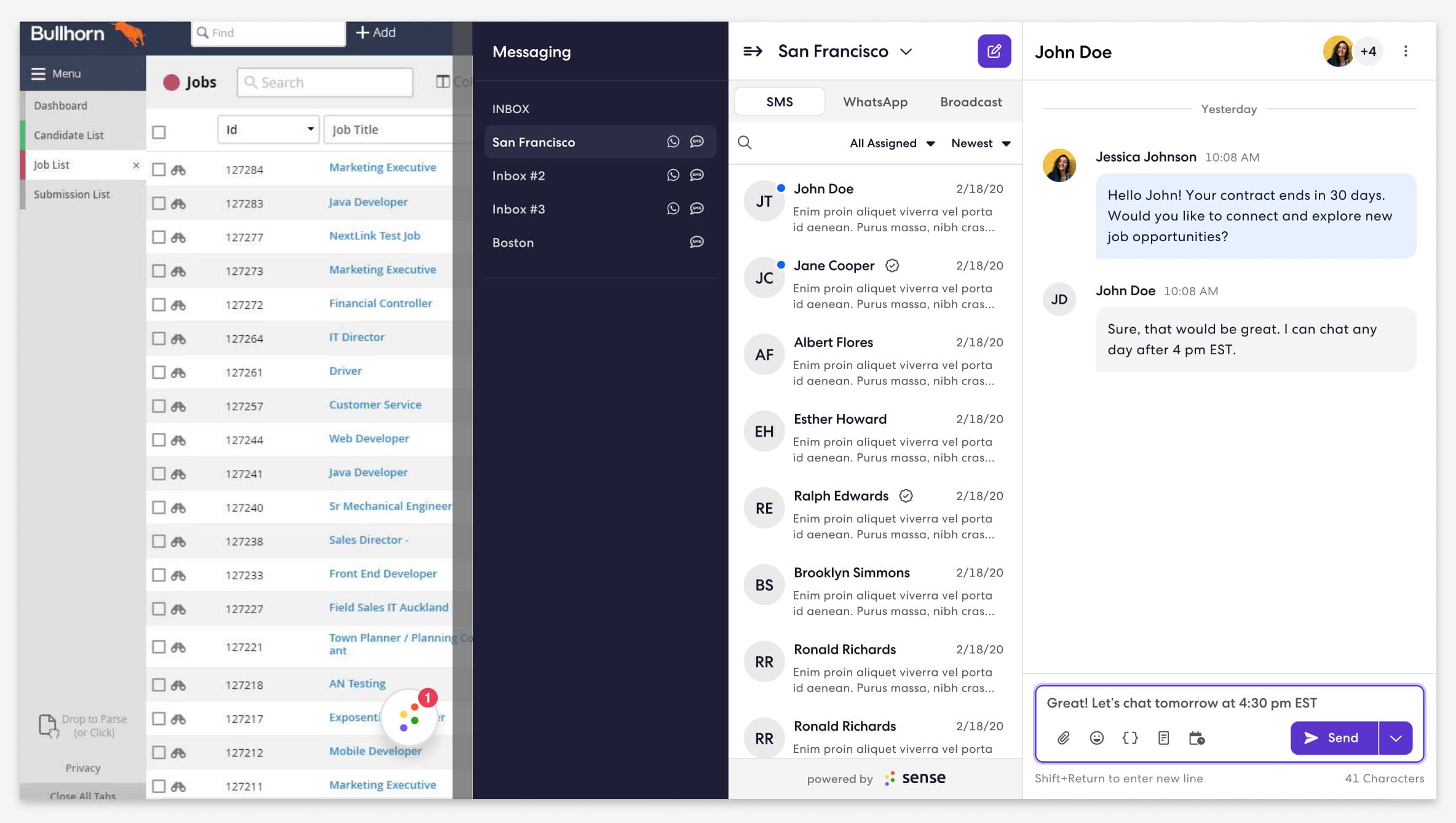
Sense Messaging is the app recruiters keep open all day: SMS and WhatsApp with candidates, in a Chrome extension docked beside the applicant tracking system. It had never had a designer. This is how we moved it onto the new design system and a new architecture, and what recruiters told us when we did.
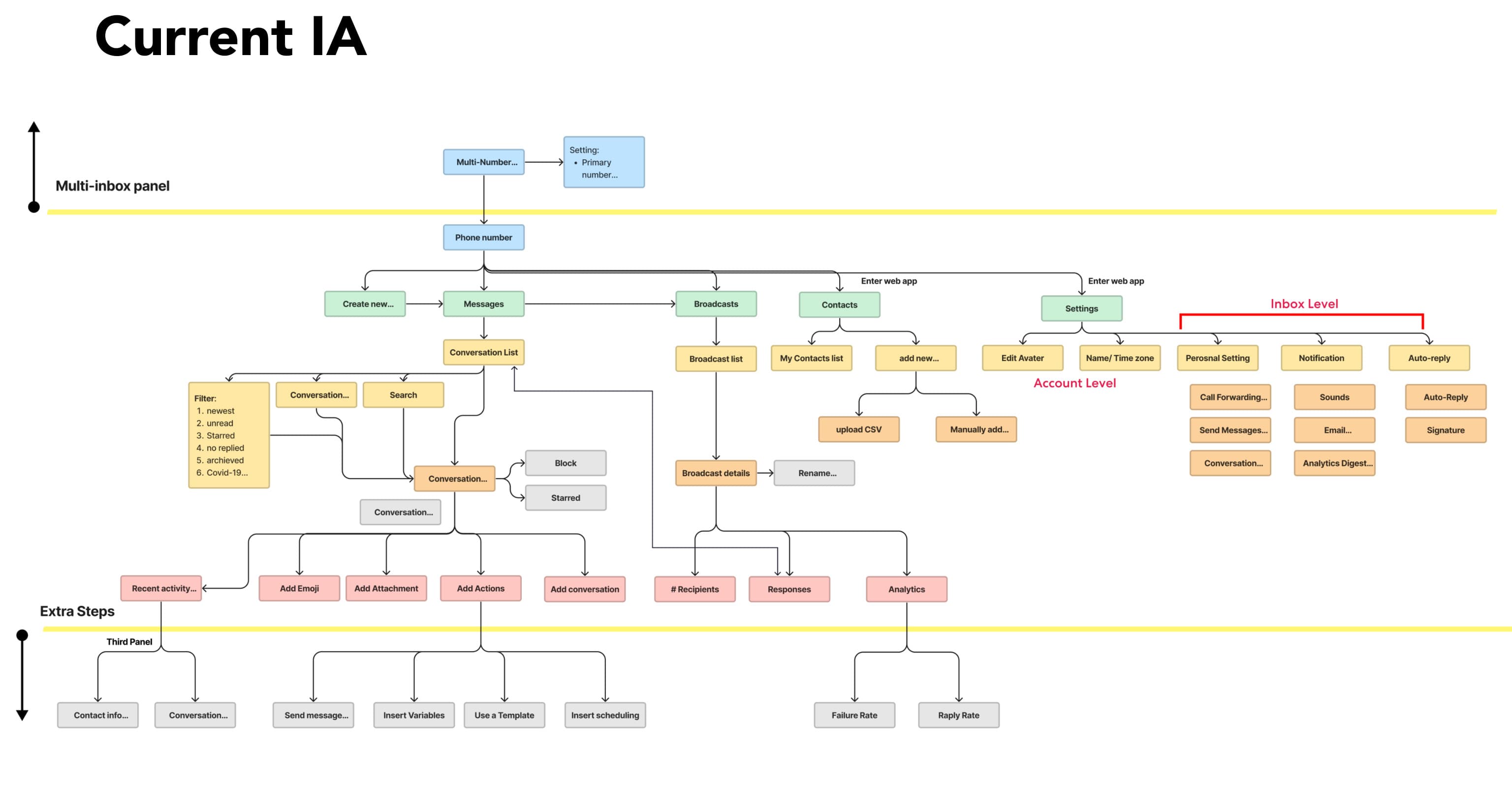
The brief was a reskin. The real work was underneath it: an information architecture that could carry the integrations the business wanted next, and a modernised, accessible interface that people would trust enough to keep using.
The Problem
Messaging gives recruiters a fast way to engage candidates, but the app had grown by accretion. Most of its functionality had been designed by engineers and the PM, and it showed.
- An outdated design system that fell short of current accessibility standards.
- A cluttered interface that made onboarding new recruiters slow and drove support tickets.
- An information architecture that could not scale to the product integrations coming next.
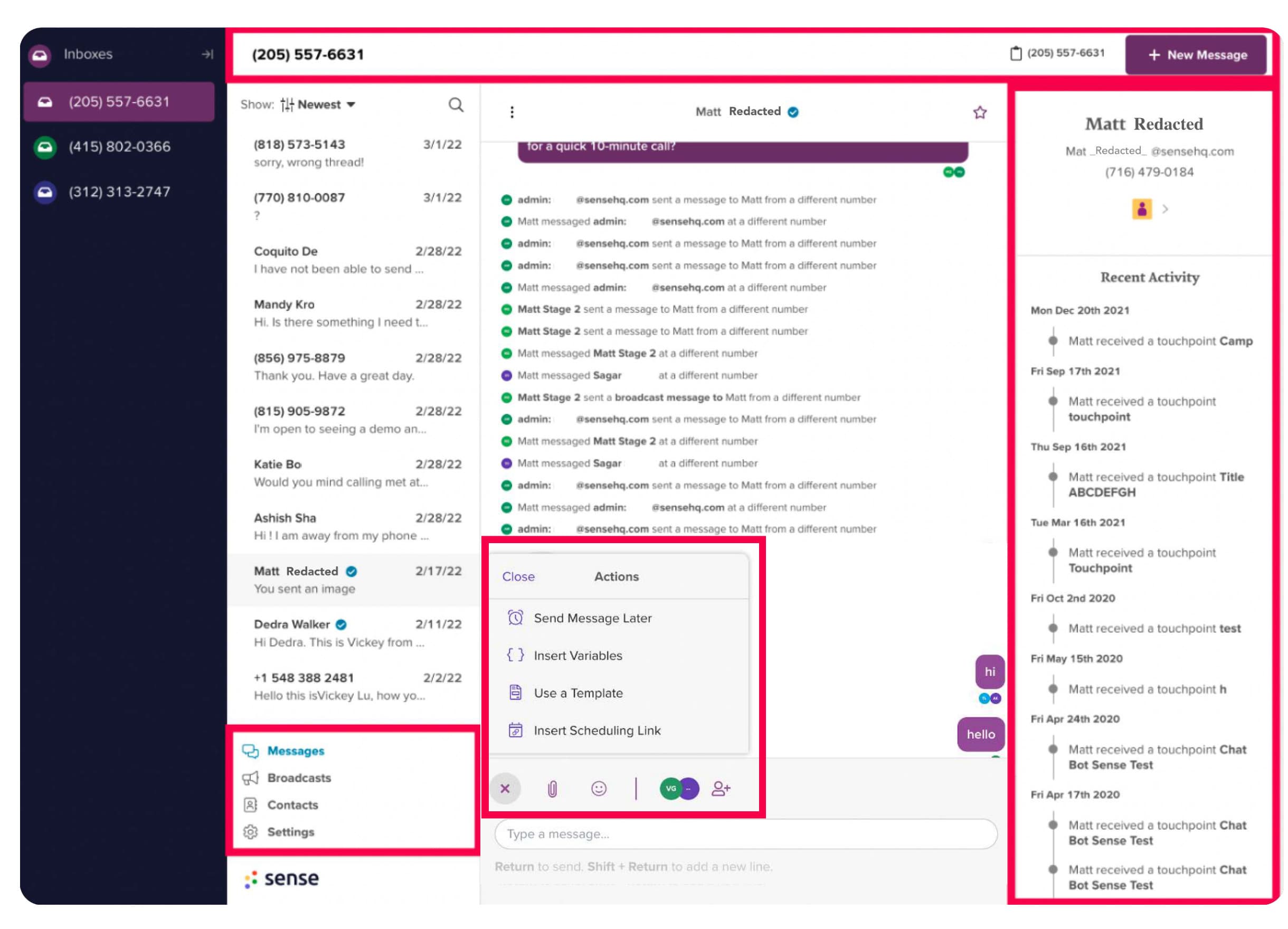
We also watched a Slack channel of user feedback. Recruiters did not know they could control their message view, wanted more control over how inboxes were organised, and were unhappy about delivery issues, which design alone could not fix. The recruiters themselves wanted to find and contact suitable candidates fast, stay organised, and coordinate with clients; their pain was engaging at scale, giving clients real-time updates, and losing opportunities to usability.
Getting Agreement Before Pixels
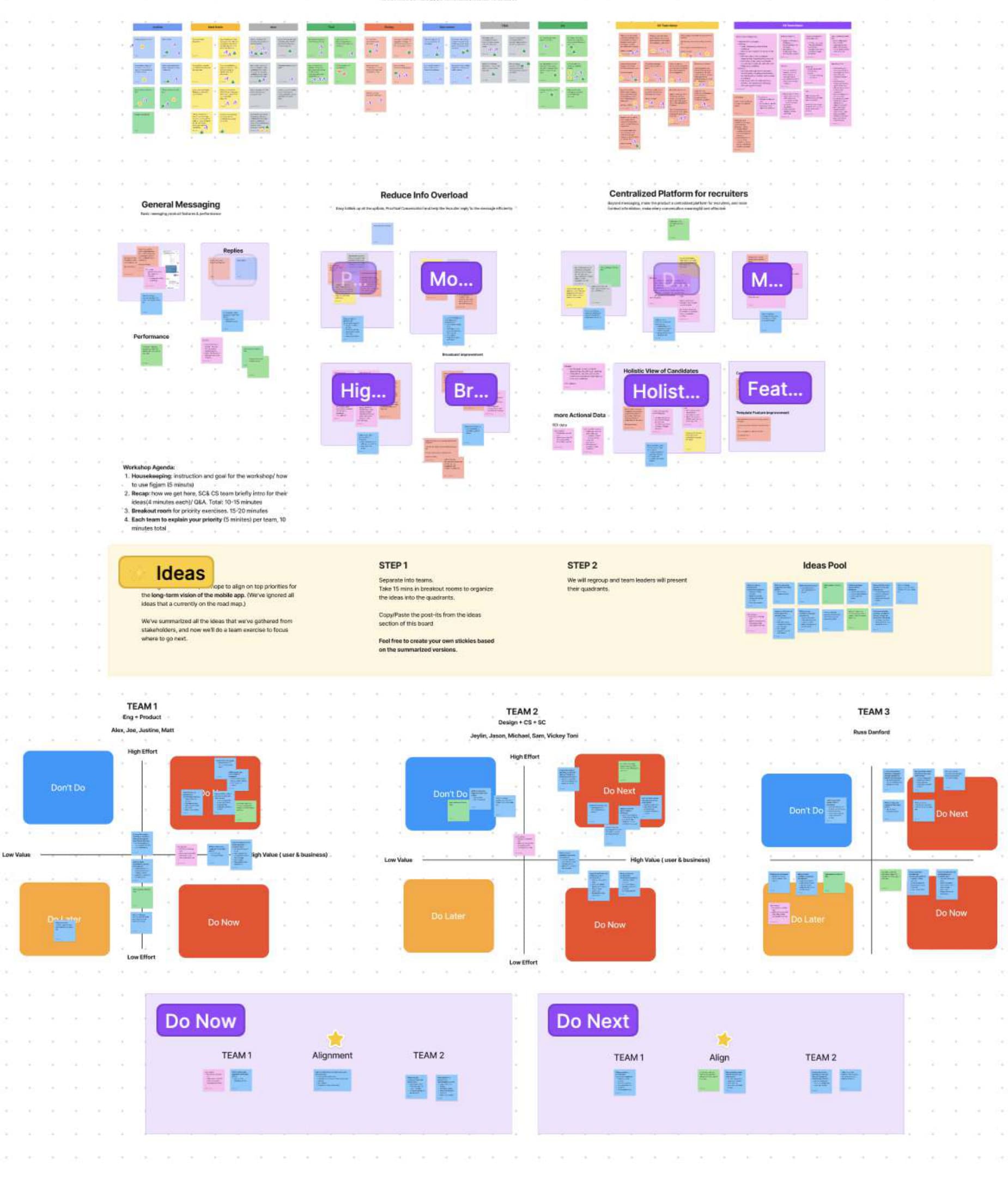
We knew the UX problems. The harder question was how to make the next Messaging future-proof while getting buy-in from the people who would fund and sell it. Sense sells itself as a cohesive ecosystem, and with AI arriving across the company this was the moment to ask how it might help recruiters write. So before designing anything I ran a three-day workshop with sales, customer success, product and engineering, judged against three pillars: business objectives, build effort and UX principles.
- Post-it brainstorm, then voting on favourites.
- Grouping into themes.
- Team prioritisation by effort and severity.
- Synthesis into next steps: what we do now, what waits.
Now: help recruiters write better messages (later, with AI-generated content), build trust with a current-looking interface, and cut the usability problems that fed support. Later: stability, a proper Broadcast workflow, a more holistic view of the hiring pipeline, and better notifications in the mobile app. Each of those needed research or resources we did not have yet, and saying so out loud kept them from creeping back in.
With the other designers and the engineering leads I then proposed the launch order: reskin on the new design system; move main navigation under each inbox to match the new architecture; rebuild the compose bar; reach feature parity on everything else; no integrations yet, but a layout engineering knew would have to take them. Two-week sprints, with design QA in every one.
Testing Two Layouts
After looking at how TextUs and Intercom organise the same job, we drew two options on the same four levels: a global app bar for future integrations, an inbox level listing conversations by channel, the conversation itself, and a details panel that only opens when an action needs it. The difference was where the secondary navigation lived and how much compose sat in view.
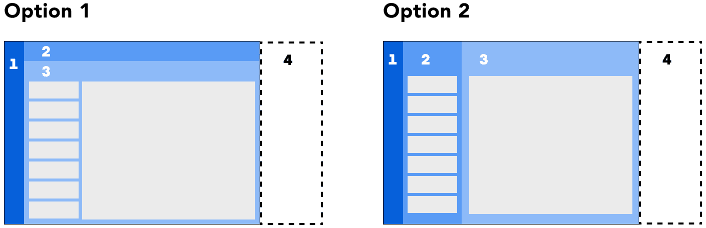
1. Primary: Global
App bar for future product integrations, the part we brainstormed on.
2. Secondary: Inbox level
Inbox to see conversations listed by channel.
3. Tertiary: Conversation
Where conversations with candidates happen.
4. Quaternary: Details panel
A hidden panel that expands when an action requires it.
I wrote a research plan and we tested both with recruiters, customer success managers and implementation experts. The results pointed to Option 2 as the more usable layout, for 2 reasons.
- It followed the established pattern of messaging apps, so it read panel by panel and was easier to scan.
- It put more of the compose actions at the front of the experience instead of behind a menu.
What the Beta Said
We put the new design in front of 860 recruiters in beta and, after four days of use, asked them a two-question survey inside the product. 121 answered, and 45 left comments. Satisfaction skewed negative: about half were dissatisfied, a third satisfied. That is roughly what a big change to a daily tool does, and the people most likely to write a comment are the ones who are unhappy. The comments were where the value was.
| How satisfied are you with the new design? | Responses | Share |
|---|---|---|
| Very dissatisfied | 28 | 23.1% |
| Dissatisfied | 34 | 28.1% |
| Neither | 18 | 14.9% |
| Satisfied | 27 | 22.3% |
| Very satisfied | 14 | 11.6% |
Very dissatisfied
- Responses
- 28
- Share
- 23.1%
Dissatisfied
- Responses
- 34
- Share
- 28.1%
Neither
- Responses
- 18
- Share
- 14.9%
Satisfied
- Responses
- 27
- Share
- 22.3%
Very satisfied
- Responses
- 14
- Share
- 11.6%
| Comment theme | Mentions |
|---|---|
| Extra clicks for user details | 13 |
| Inbox panel too big | 7 |
| Change resistance, no specific reason | 10 |
| Bugs | 6 |
| Templates | 3 |
| Text alignment | 3 |
| Enhancements | 1 |
| Font too big | 1 |
Extra clicks for user details
- Mentions
- 13
Inbox panel too big
- Mentions
- 7
Change resistance, no specific reason
- Mentions
- 10
Bugs
- Mentions
- 6
Templates
- Mentions
- 3
Text alignment
- Mentions
- 3
Enhancements
- Mentions
- 1
Font too big
- Mentions
- 1
The three most common complaints: candidate information now sat behind an ellipsis, one click further away; the left navigation panel took up too much room and could not be collapsed; and bugs, from hard-to-read text to a scheduled message that would not send. A good share of the rest was preferring the old design, which we noted and did not act on.
Three Fixes from the Beta
Recruiters wanted a candidate’s name, phone and email in view, because they used them constantly, often to pick up the phone. Two comments put it plainly: one wanted to see details on the main screen in case they needed to call someone; another said the old side panel had been convenient and the three dots were an extra, unnecessary step.
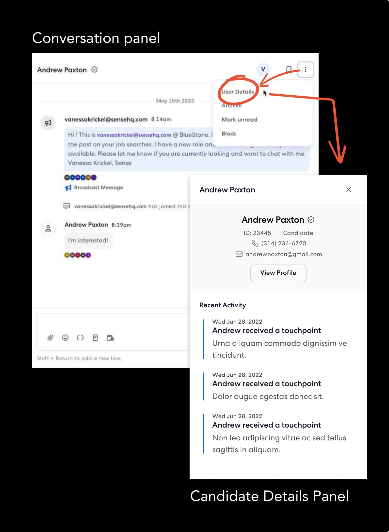
Before: details behind the ellipsis.
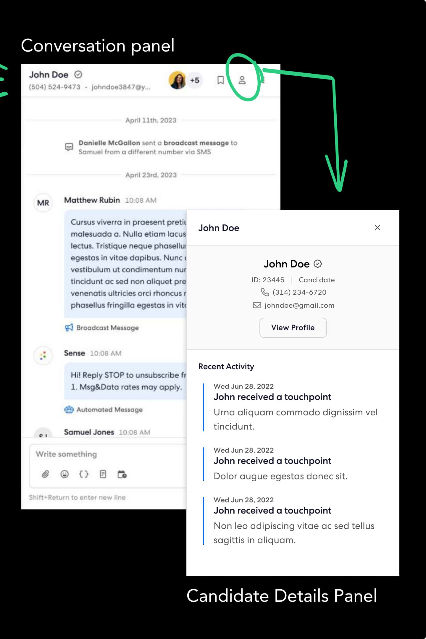
After: a one-click details icon, and phone and email in the header.
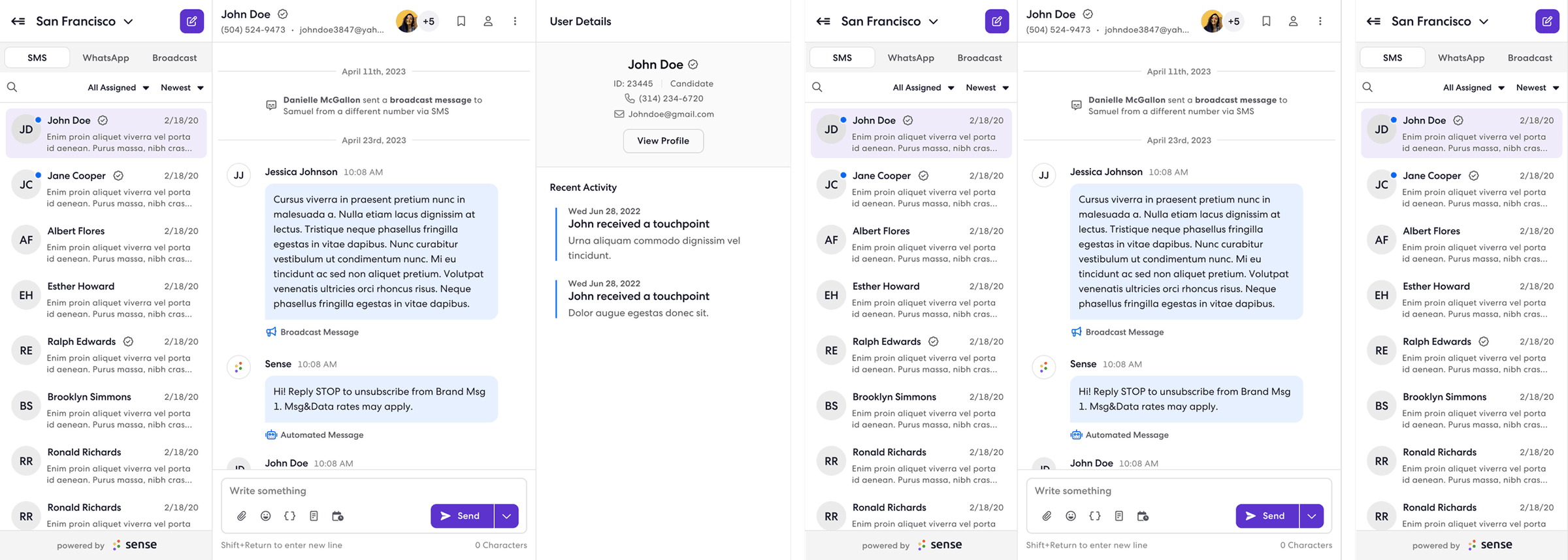
The fix: in one- and two-panel views, a details icon opens the candidate panel in a click; in three-panel views, or wherever there is room, the details panel shows by default instead of the submenu; and phone and email sit under the name in the header. The trade-off was avatars: to keep the header responsive we show only the account holder’s.
The second issue was the inbox navigation panel. It took too much space, was hard to close at some resolutions, and people wanted to collapse it. Rather than surfacing it automatically in two- and three-panel views, we show the details panel there instead, since messaging candidates is the job. To keep other inboxes’ activity visible, a notification badge went onto the menu button.
- Message text hard to read: moved from grey to our darkest primary colour.
- "Add template" button missing: designed.
- Support tab covering the view: right padding added to panel views.
- Scheduled messages not sending: an engineering fix.
Outcome
Messaging launched on the new design system with the new architecture, at feature parity, eight months in. The two most common beta complaints were the first two things fixed after launch. Success is being measured three ways.
- Adoption: how often features that were rarely used before are used now, such as conversation context and conversation owner.
- Friction: CSAT and NPS surveys with free-text fields, so we hear the why.
- Efficiency: time to send, time to respond, SMS delivery rate, and the carrier filtering rate.
Two things I took from it. You cannot predict the future, but you can try: Messaging had a history of re-implementing features, and validating the vision against known data with stakeholders is what kept now and later apart. And change resistance is real. A popular app’s new architecture will be met by people who liked the old one. That is normal; the job is to be patient while they find their way around, and to listen for the complaints that are actually design problems.