2020 · Sense
Recruiting through conversation
I designed Sense’s first chatbot 0→1, from the recruiter’s setup flow to the candidate’s conversation, taking repetitive work off recruiters and giving candidates answers at any hour. Shipped in 6 months.
- Role
- Lead Designer
- Team
- ML engineer, PM, front-end engineer
- Timeline
- 6 months
- Tools
- Figma, Notion, UserTesting
Overview
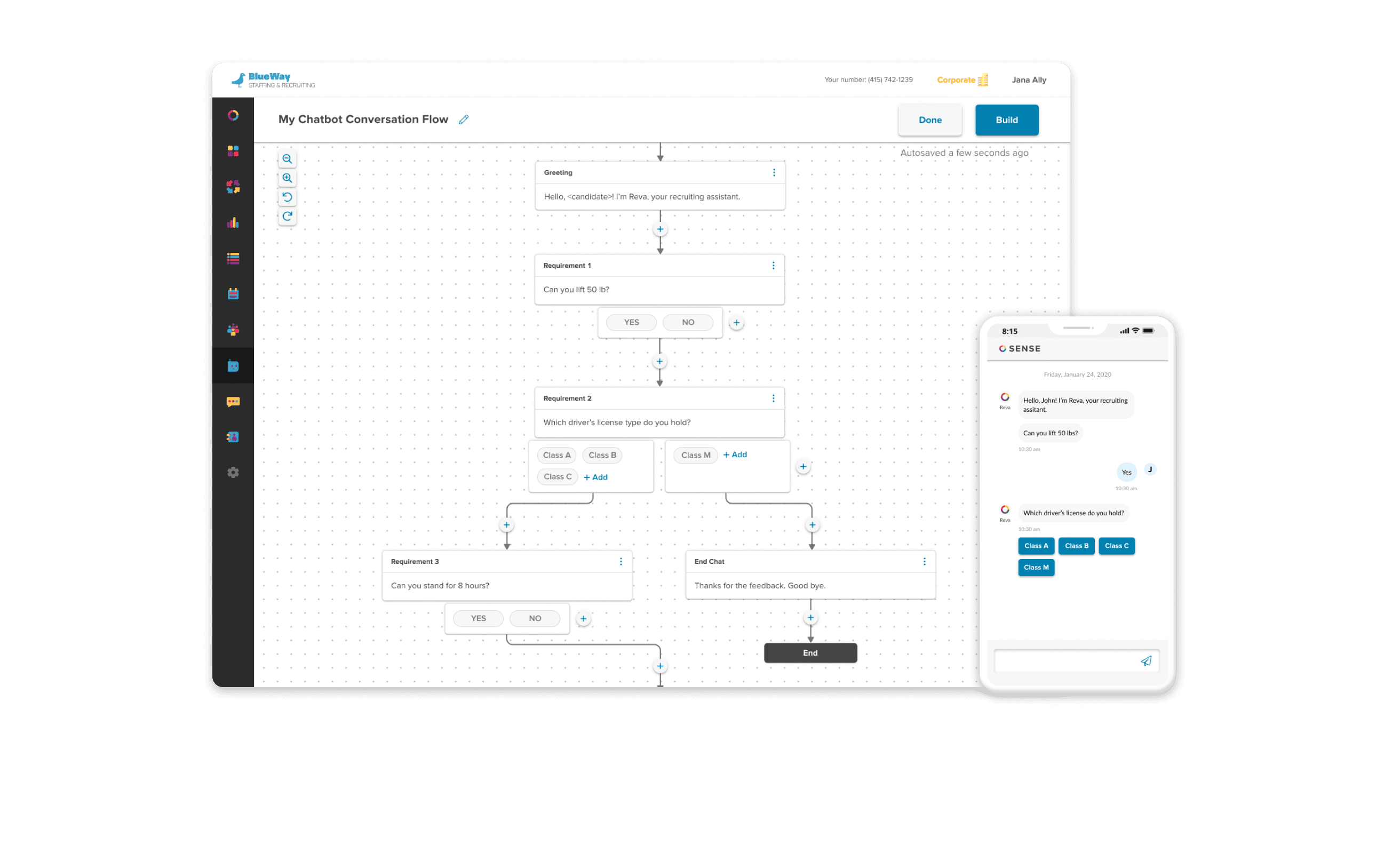
Sense's third product: a chatbot that talks to candidates, and the canvas recruiters use to decide what it says. Both shipped in six months, in the middle of 2020, and by December ten agencies were paying for it.
Sense sells automation to recruiting agencies: personalized outreach that keeps candidates engaged and writes what it learns back into the applicant tracking system. When the pandemic hit, the chatbot was already on the roadmap with an ambitious timeline. Staffing was one of the hardest-hit industries, contracts were churning, and the plan became a sprint: get to market with something customers would pay for before the market disappeared.
The Problem
Recruiters juggle too many candidates to give each one real attention. Much of the early contact is mundane: confirming what is already on a résumé, reading out a job description. When the candidate turns out to be unqualified or unavailable, that call was wasted for both people. Meanwhile sourcing candidates was, by the industry’s own account, the hardest part of the job, and it had been for years before the pandemic made it harder.
Three groups had to get something out of a chatbot for it to work.
- Agencies wanted lower acquisition cost per candidate, and workflows that ran the same way at scale.
- Recruiters wanted less manual data entry (up to 60% of their time), fewer conversations with unqualified or unavailable candidates, and better relationships with the ones in their pipeline.
- Candidates wanted to feel that they mattered to someone, and to hear back clearly and consistently.
How do we accelerate hiring for recruiters while keeping the candidate experience genuinely good?
The goal was a chatbot for three common jobs: data collection, pre-screening, and job matching. The foundation was data collection, because it exercised Sense's core strength: the answers a candidate gives update the ATS automatically. The team was four people, an ML engineer, a product manager, a front-end engineer and me, leading all design.
Learning the Territory
I had never worked on chatbots or in recruiting, which was part of the appeal. I started with the basics: what a recruiting chatbot is, where they are good and bad, what the best ones do. No formal method, just reading. Since we had no product manager yet and I could not assume the next hire would know the space either, I wrote everything up in Notion as the onboarding document for the chatbot team.
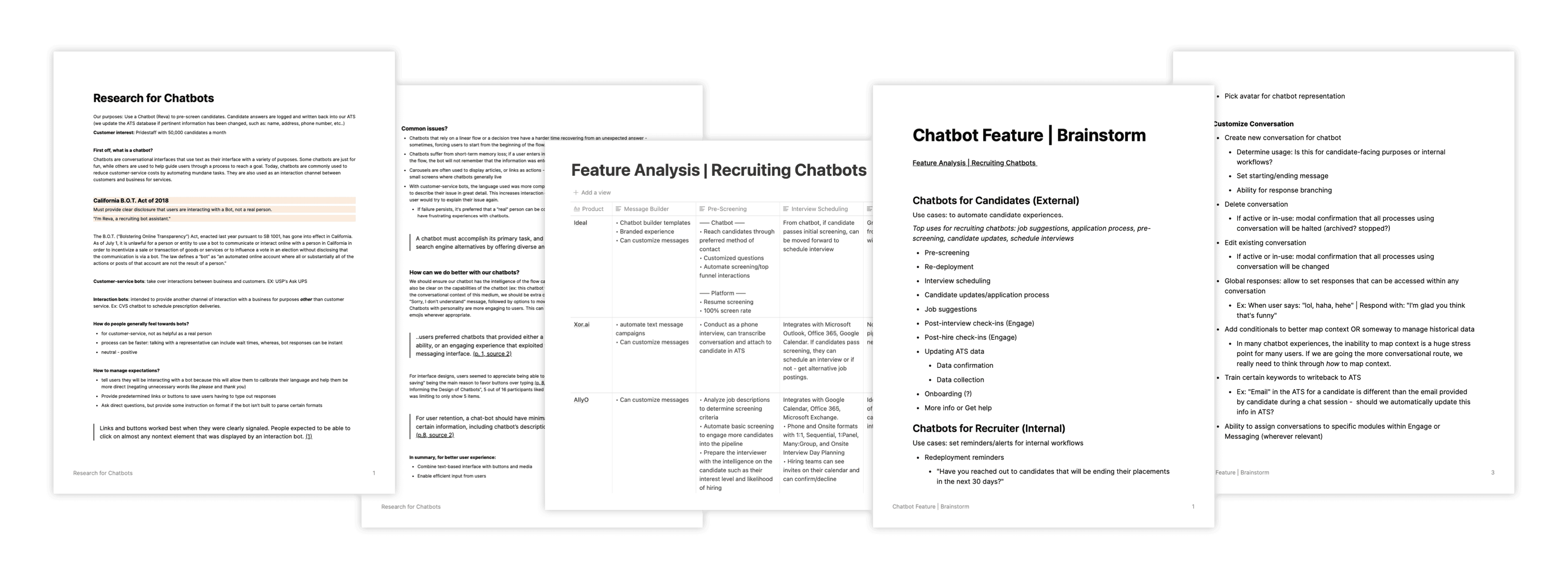
A feature analysis of the leading recruiting chatbots showed what we would eventually need to match. Our first version would be a sliver of that, but the one advantage none of them had was that ours would sit inside Engage and Messaging, the products agencies already used. The findings lined up with what customers were asking for: automate the introductory data-collection calls, pre-screen, and write the results back to the ATS. When the product manager joined, we used the list to scope the MVP: a web chatbot for data collection first, SMS second.
Designing Reva
A demo had been in progress for months before I joined, understood only loosely as a web bot that would use natural language processing to tie a conversation back to ATS fields. Our ML engineer was building the write-back API to Bullhorn and the validation that keeps bad data out: ask for a zip code, check that a real one came back. My part was the style guide, and choosing with the PM which scenario to demo.
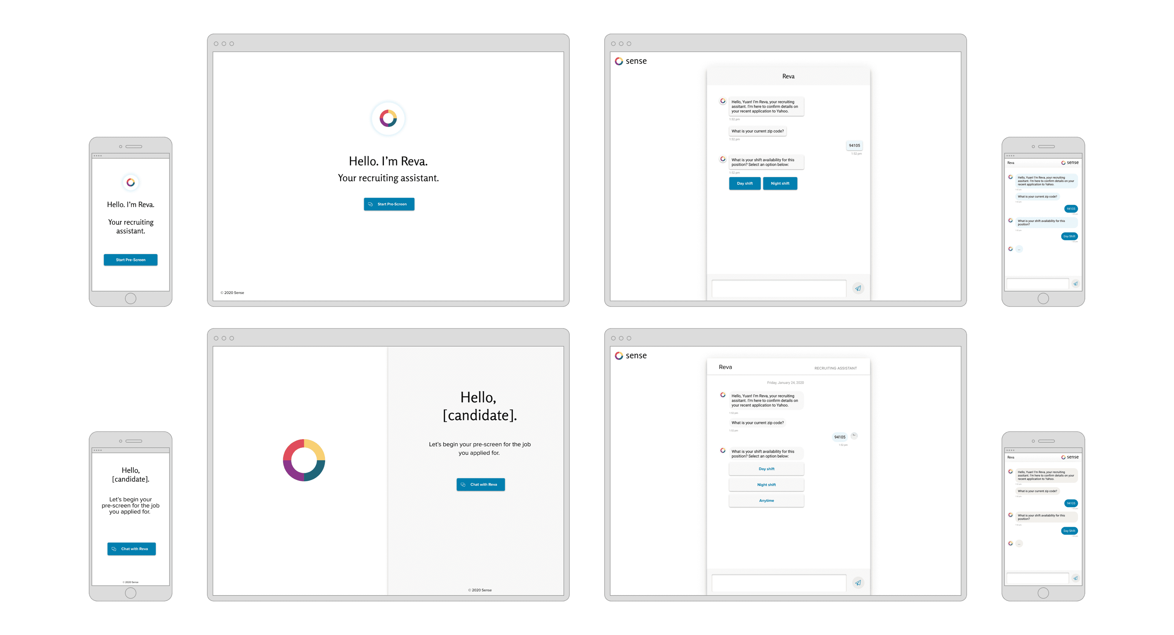
The early concepts took their cue from Microsoft's Cortana: a soft glow over an unassuming circle felt simple and inviting, which was the character we wanted. The conversation itself followed the conventions of every messaging app, on purpose: bubbles, a typing indicator that doubles as a loading state, and a layout that is comfortable on a phone.
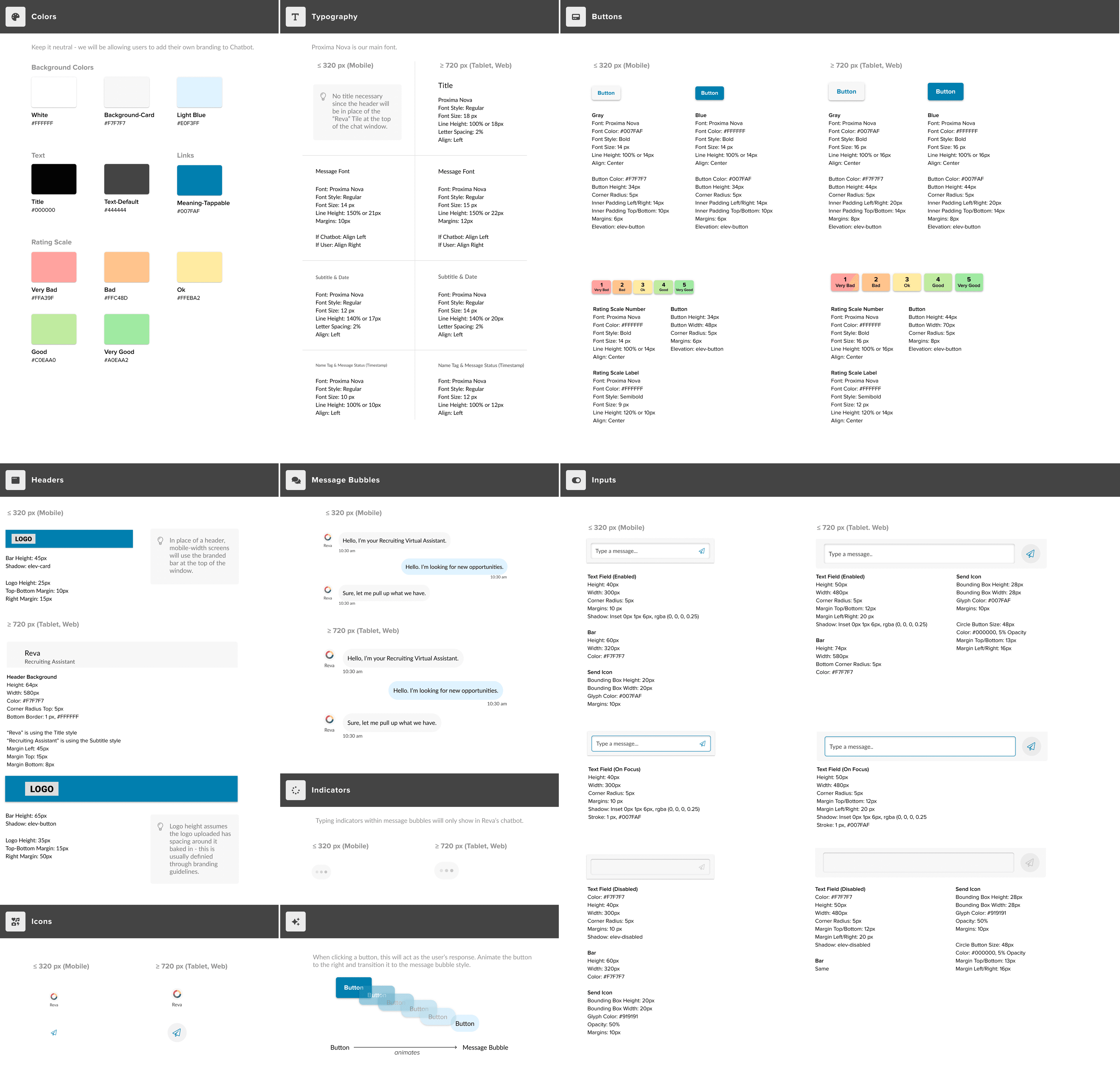
The design system for the candidate side was derived from the styles already in Engage, with one addition: colours for the rating scale, chosen against contrast requirements so the whole thing met WCAG. Our brand designer was working on a new website with beige at its centre, so I tried beige chat bubbles. They looked awkward. Grey, or a lighter version of our Hawaiian Blue, won every round of feedback for being easy on the eyes.
Two months in, the first candidate-facing demo was ready and we put it in front of the whole company. A Slack channel collected feedback, bug screenshots and opinions; my research plan focused on how the conversation felt and on whether the collected data actually landed in Bullhorn. Much of it was positive. Some of it overturned assumptions we had been carrying.
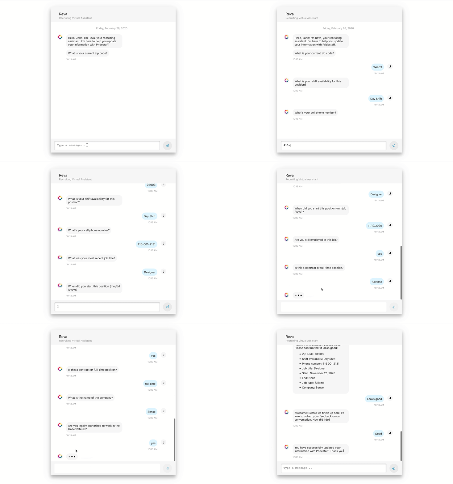
- The bot could not parse conversational answers like "My phone number is 415 222 1111." Now it can.
- Multiple-choice questions had no way to say "none of these." We added an out.
- People wanted the bot to confirm what it had recorded. It now does, before moving on.
- Error states were vague. Validation replies became conversational: "Sorry, I can’t find that zip code."
- The tone read as robotic. I wrote a library of softer phrases to draw from.
From there the candidate experience went through UserTesting rounds to validate the data-reactivation and pre-screening use cases, and into trial accounts for two of our largest customers to run with their top agencies.
The Conversation Flow Designer
In parallel I was designing the other half of the MVP: the tool recruiters use to build a conversation. Custom messages, questions, response options, and which ATS field each answer writes back to. Three things we knew going in, and two constraints.
- Customers wanted a bot that collects data and records it to their ATS.
- Customers wanted a bot that pre-screens candidates for qualifications and required skills.
- Existing customers wanted it inside Engage Journeys, so it fit the workflow they already had.
- Constraint: if we lived inside Journeys we could not change its page hierarchy or layout.
- Constraint: every agency names its ATS variables differently, and two agencies’ different names can point at the same Bullhorn field.
The canvas needed a few things to be legible at a glance. A subtle dot grid, so the background reads as a workspace and the flow stands off it. Arrows for direction. Two node types, message and question, that look different because they do different things. Variables limited to candidate fields, since the bot only ever talks to candidates. And a way to edit a node that could grow as we added fields.
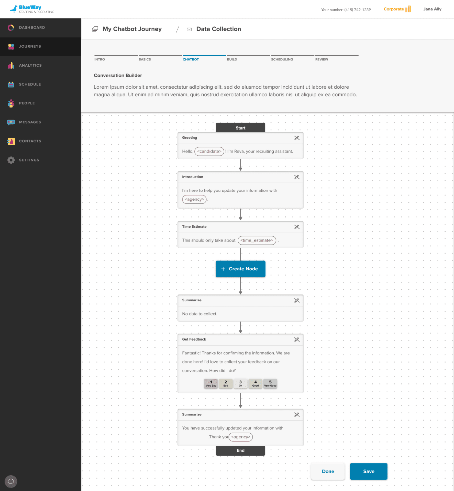
Flowchart: omnidirectional, with a drag-in toolbox.
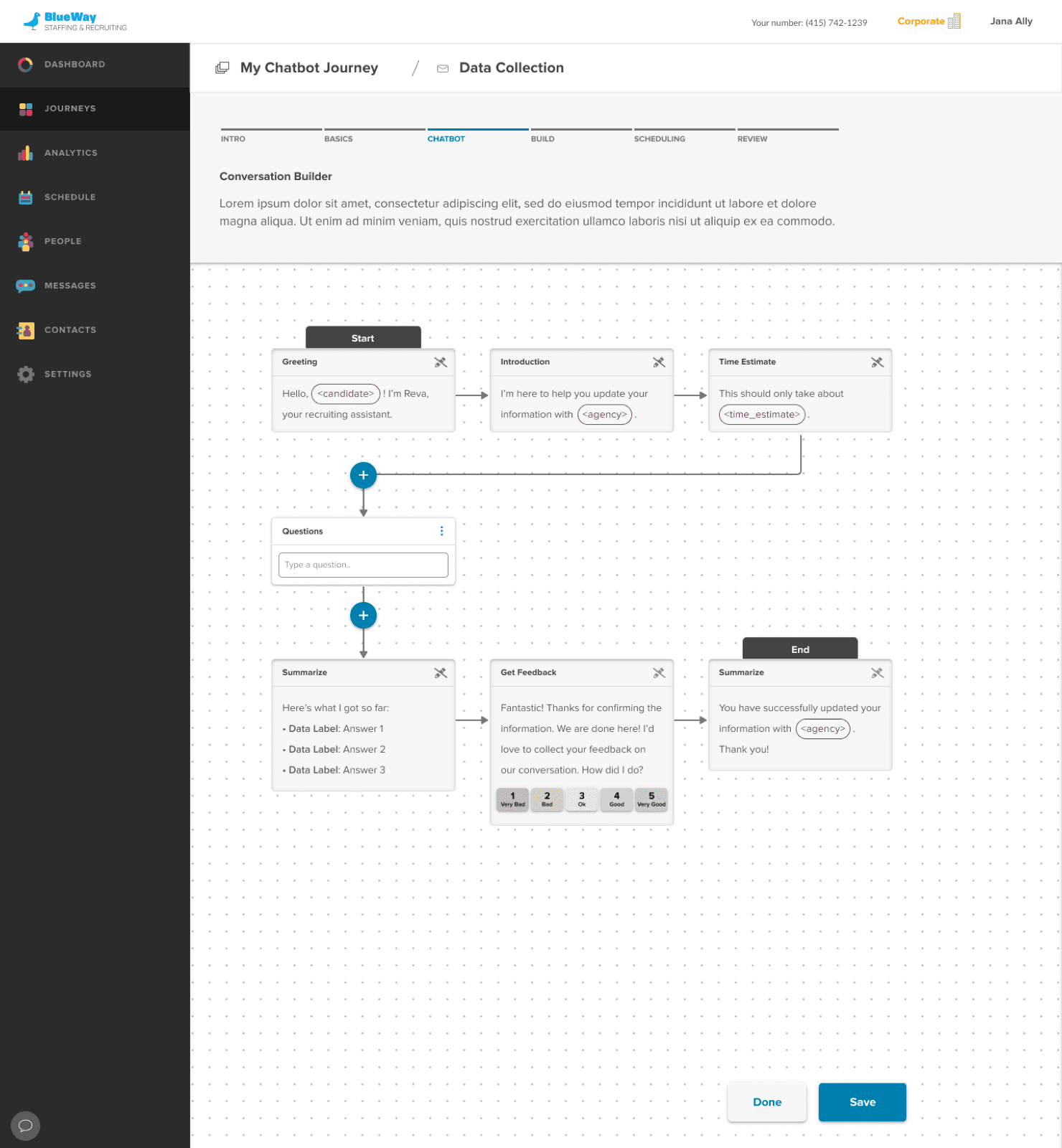
Vertical: one node per row, top to bottom.
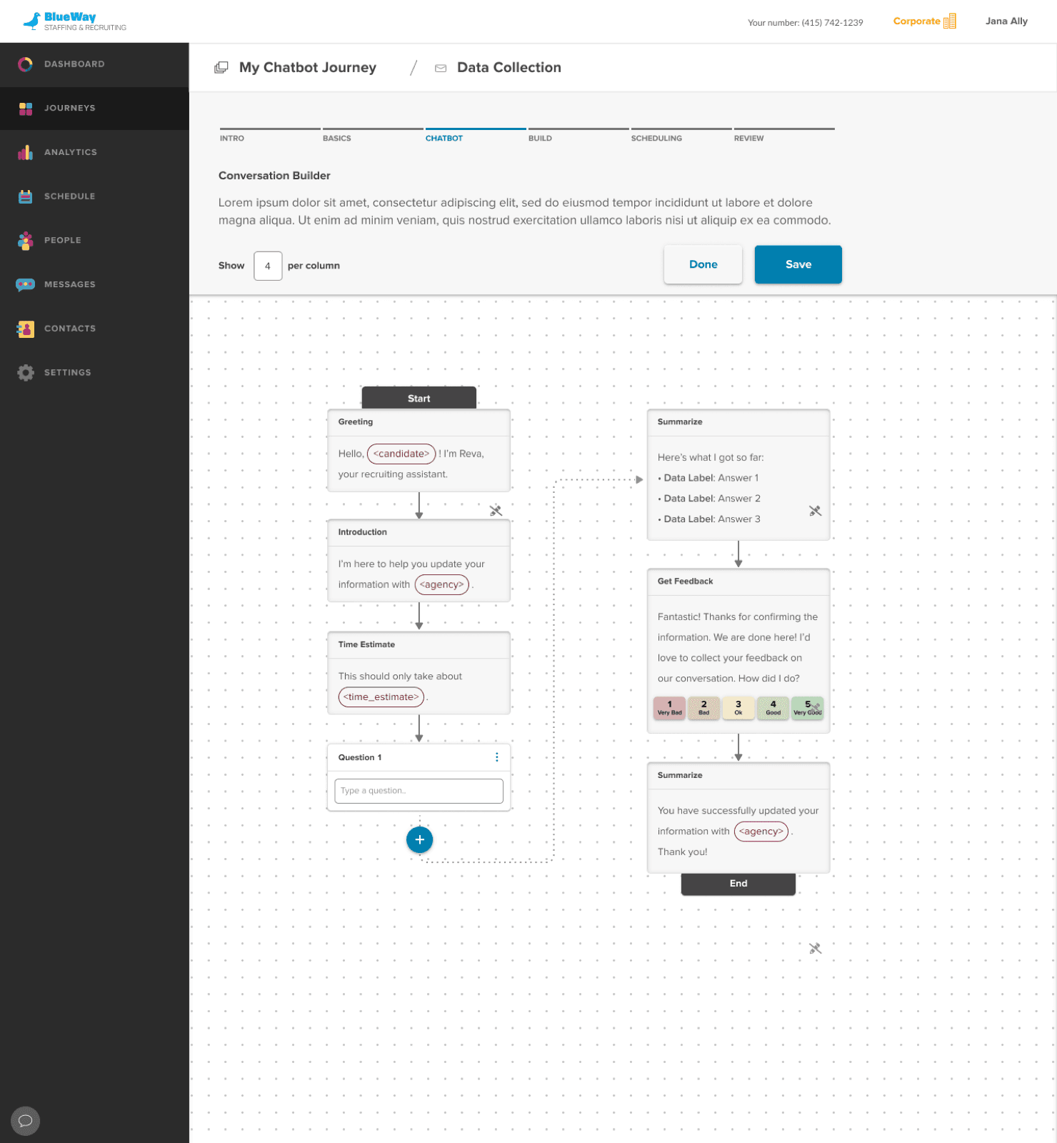
Columns: rows that wrap, to save vertical space.
Editing was the harder question. My first idea, borrowed from Adobe, was a small toolbox that could snap to the grid or float free: unobtrusive, and easy to move out of the way. Drag and drop was out of scope for the MVP. The second was to edit directly inside the node on the canvas, which could not scale as fields were added. The third, a floating modal, had the room of a form and kept the canvas navigable. We went with the modal.
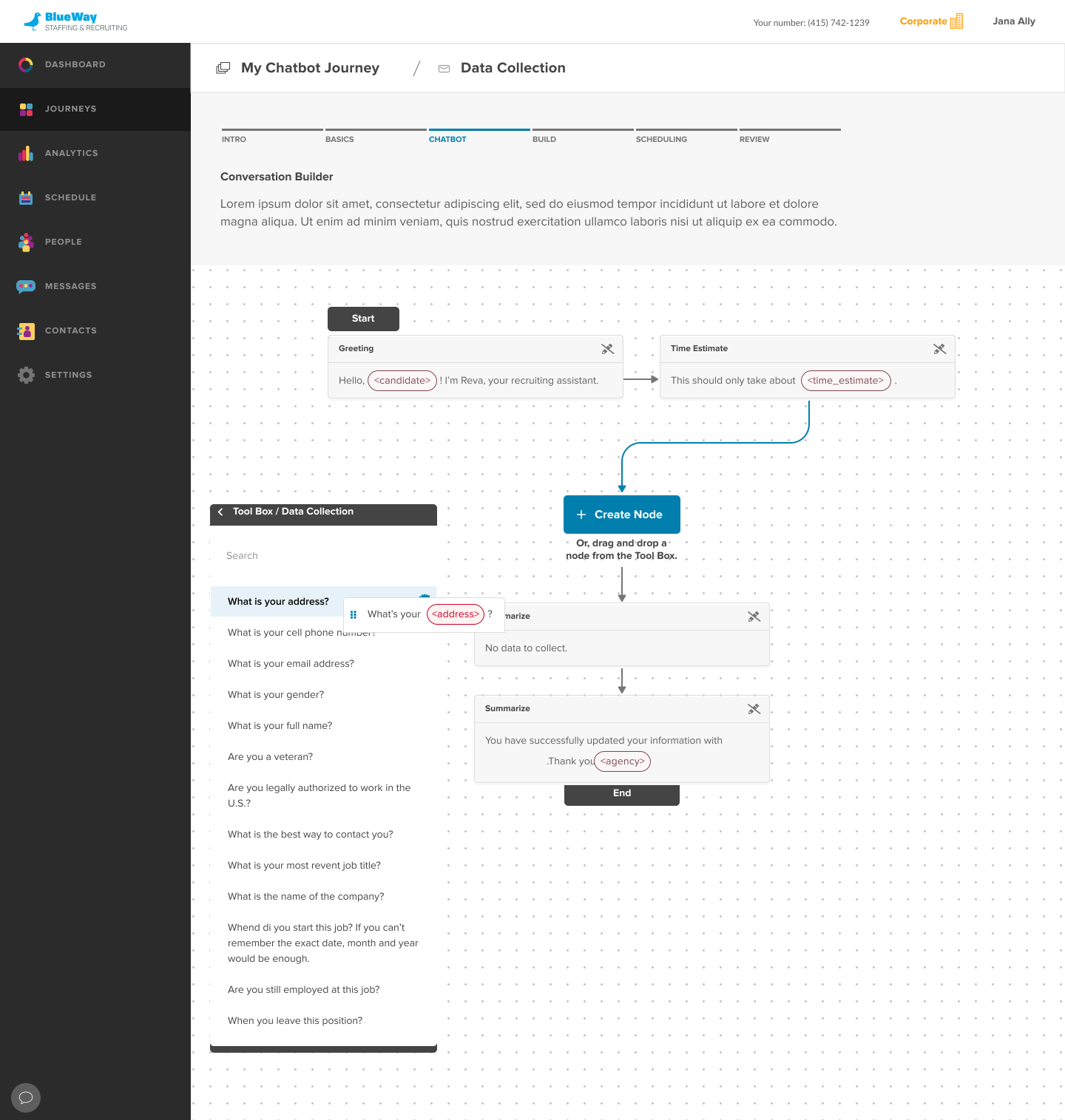
Toolbox: drag a question in. Out of scope.
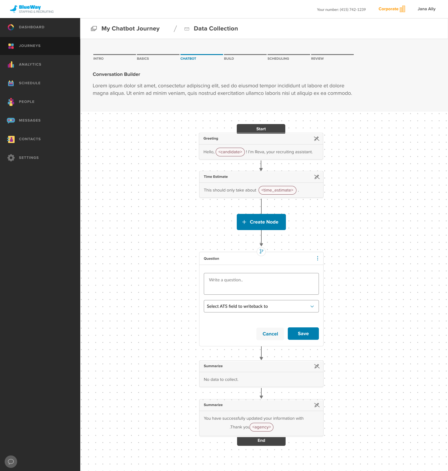
Inline: the node is the form. Would not scale.
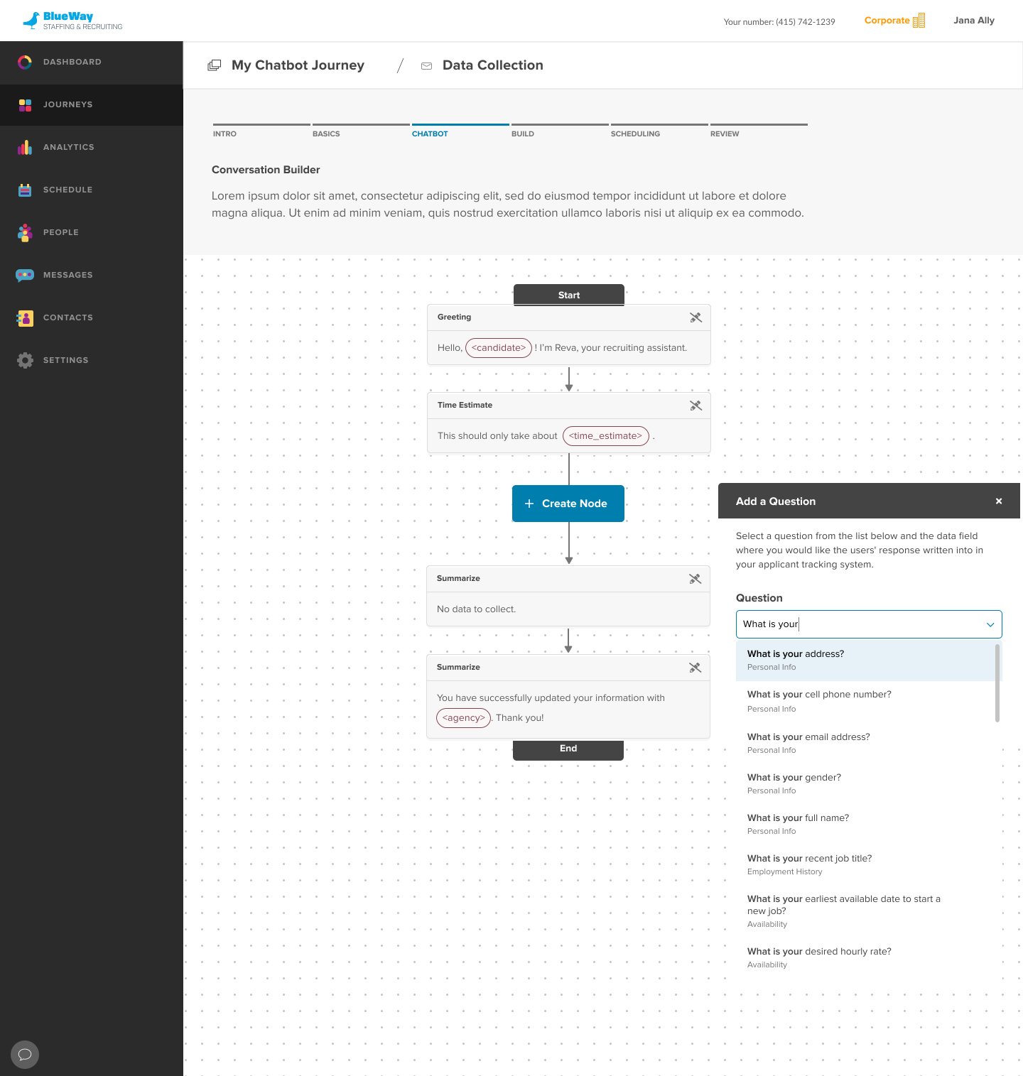
Modal: room for fields, canvas stays usable. Shipped.
With editing settled, I explored the nodes themselves. The question node would be the most used, so I studied how survey builders handle question types and split it by the kind of answer it takes. The selling point was in the last field: pick the ATS field the answer writes back to, and a recruiter never types that data again.
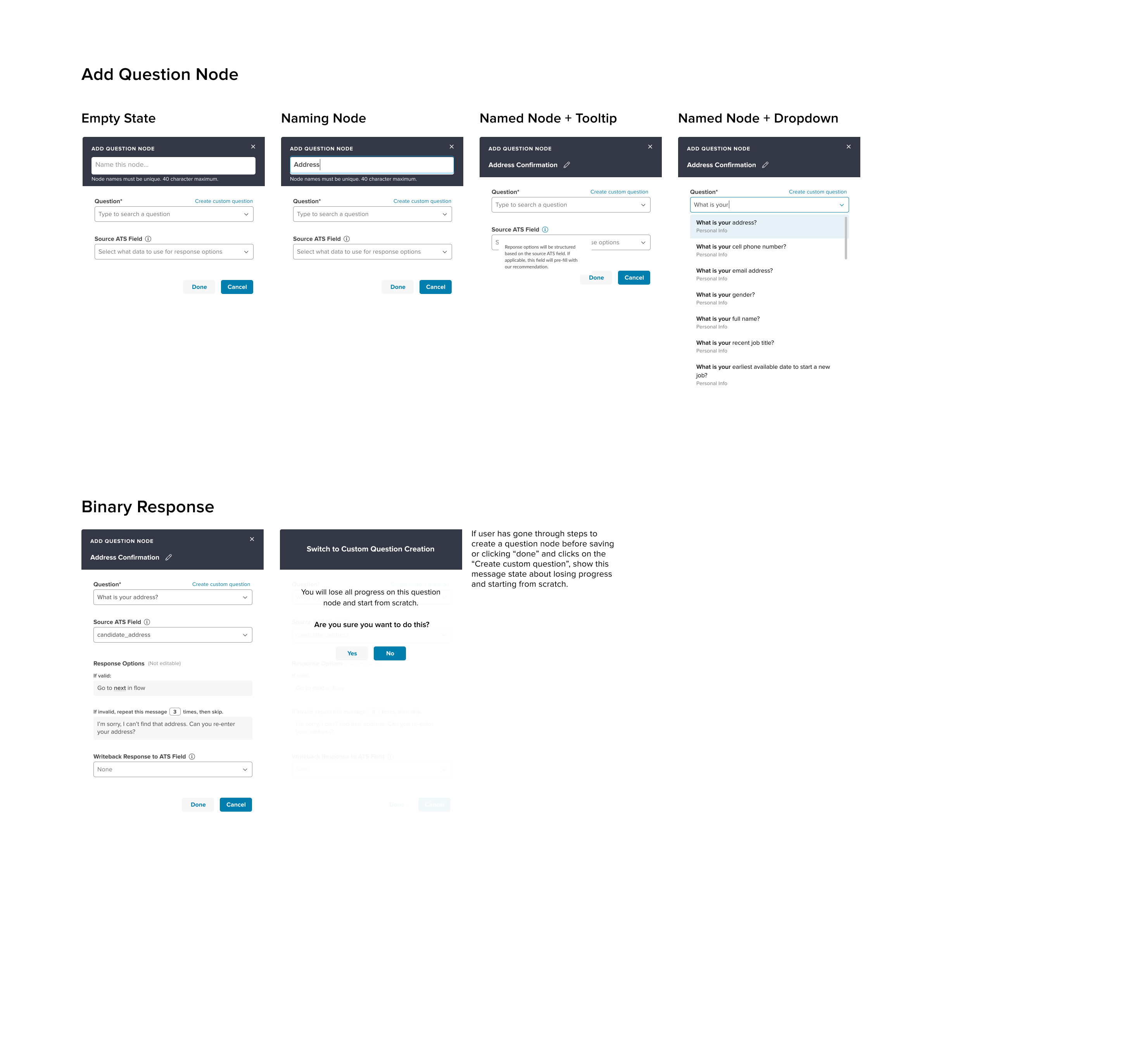
Question node: from empty state to a validated answer.
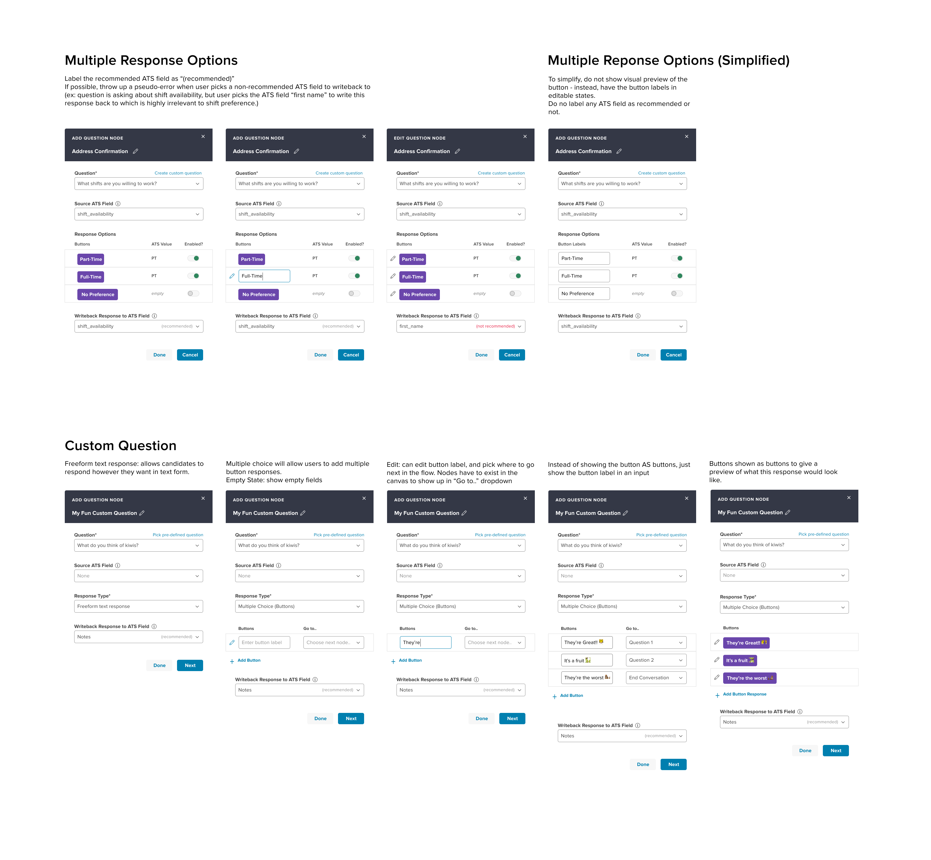
Response options, and a fully custom question.
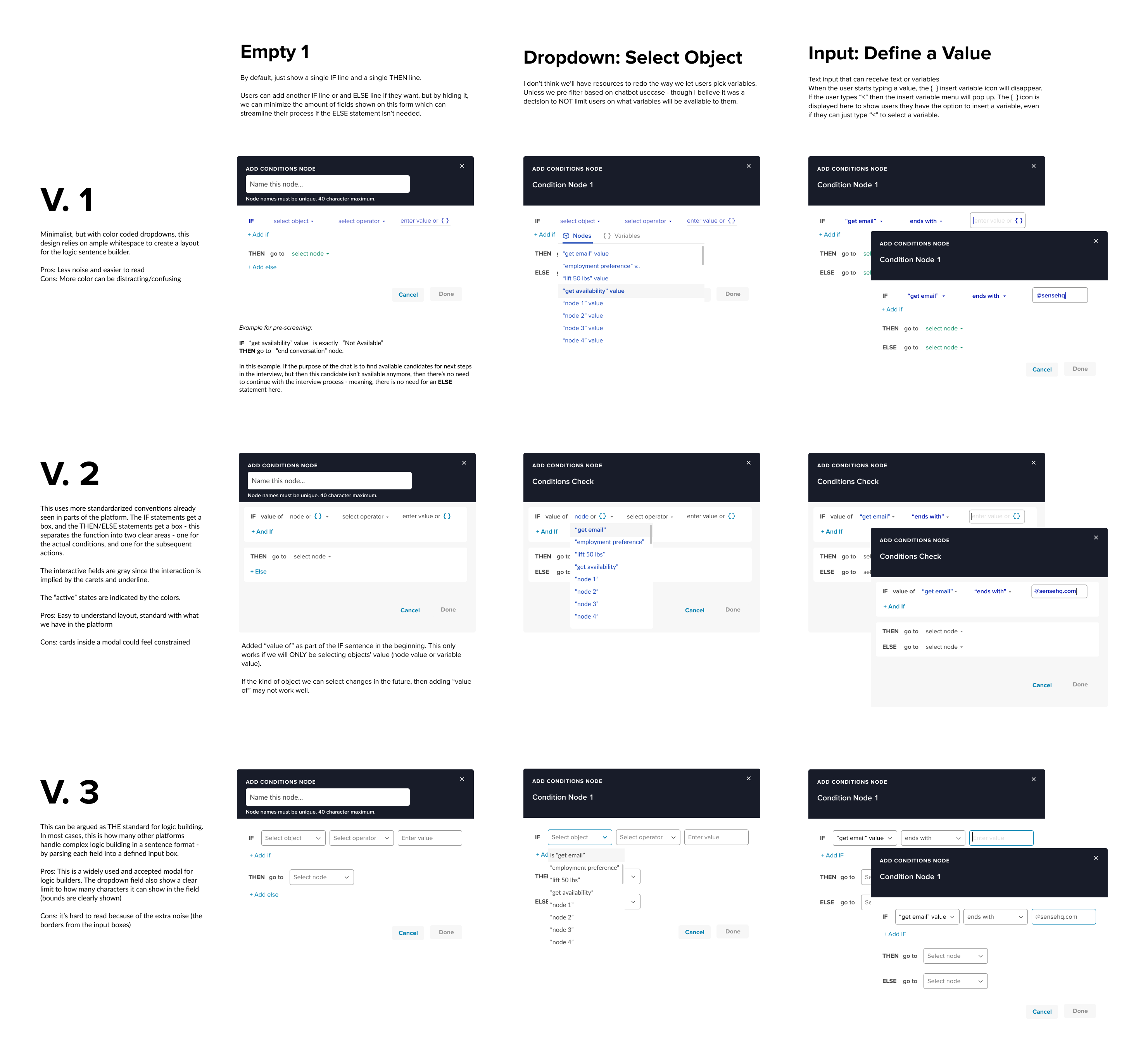
Condition node: three ways to write if, then, else.
Branching
By June we wanted a condition node in before the public launch, so a flow could route on what it had learned: compare a collected answer to a value, from the ATS or typed in, and send the candidate down one path or another. That was the first branch, and the design got harder immediately. A branch is one permutation. Users can keep branching, and a conversation with real pre-screening depth becomes a canvas nobody can read.
Conversations wander; a chatbot’s wandering just has a purpose. Our first use cases were simple, but what if a customer wanted to go deep on a candidate’s answers? I took the question back to the team.
- Engineering: branching is hard. The simpler we keep it now, the better it scales later.
- Product: it has to be easy to do and easy to undo. We do not want to limit how far people customize.
- Customers: we want the option, so we can automate more complex interviews and eventually match candidates to open jobs.
A Product in Its Own Right
The MVP assumed chatbot creation would live inside Engage, Sense’s main platform. Engage already had a workflow for outreach campaigns, and merging roadmaps meant borrowing engineers and shipping faster. We printed the mocks and taped them to a wall. The informality did something a review meeting would not have: people from sales, customer success and marketing stopped, asked what it was, and gave us perspectives we would not have heard from our usual stakeholders.
After a few iterations we decided against it. The Engage codebase at the time made every small change a large effort. And we had started to see the chatbot as a product in its own right rather than a feature: a third line alongside Engage and Messaging, which mattered to revenue and to how the company looked to investors.
What Scaled Poorly
As development proceeded for our first enterprise customer, I grew uneasy about the form-led modal. Every new field added a row; every row made it taller. I raised it with the PM and engineering and we agreed it would become unwieldy. It did. A year later we moved the modal to a tabbed layout, which I had been pushing for since launch. It was not done sooner because in 2020 the priority was delivery, not refinement.
Outcome
The Conversation Flow Designer launched six months after the work began. Contracts churned through the pandemic and we sold the chatbot to customers before it was finished, but it shipped, and it helped keep the company in business. Not everything survived: SMS, the most requested channel, was pushed to the following quarter.
Jun 14, 2020
Sense announced the chatbot.
Jul 28, 2020
The Conversation Flow Designer launched.
Aug 6, 2020
First paying customer.
A national staffing firm ran a three-month pilot across five of its top clients. The chatbot was now the third product after Engage and Messaging.
Aug 11, 2020
Outbound pre-screening supported in the designer.
Dec 14, 2020
First enterprise-wide rollout.
Every branch and unlimited bots, making that agency our largest customer by revenue.
Dec 20, 2020
Ten signed chatbot customers.
More than double the revenue we had set as the stretch goal for the year.
Those numbers are modest out of context. In context, Sense was in survival mode and the aim was to stay above water; we came out ahead. Two years on, the picture had changed scale.
| Use case | Conversations started | Unique candidates | Active bots |
|---|---|---|---|
| Data enrichment | 268,928 | 857,797 | 130 |
| Pre-screening | 117,699 | 171,736 | 204 |
| Sourcing | 553 | 2 | 27 |
Data enrichment
- Conversations started
- 268,928
- Unique candidates
- 857,797
- Active bots
- 130
Pre-screening
- Conversations started
- 117,699
- Unique candidates
- 171,736
- Active bots
- 204
Sourcing
- Conversations started
- 553
- Unique candidates
- 2
- Active bots
- 27
| Channel | Conversations started |
|---|---|
| SMS | 312,043 |
| Mobile web | 60,442 |
| Desktop web | 14,695 |
| Unknown | 0 |
SMS
- Conversations started
- 312,043
Mobile web
- Conversations started
- 60,442
Desktop web
- Conversations started
- 14,695
Unknown
- Conversations started
- 0
| Month | Typical day | Busiest day |
|---|---|---|
| September 2021 | ~50 | ~500 |
| November 2021 | ~75 | ~950 |
| January 2022 | ~100 | ~830 |
| March 2022 | ~250 | ~900 |
| May 2022 | ~350 | ~1,200 |
September 2021
- Typical day
- ~50
- Busiest day
- ~500
November 2021
- Typical day
- ~75
- Busiest day
- ~950
January 2022
- Typical day
- ~100
- Busiest day
- ~830
March 2022
- Typical day
- ~250
- Busiest day
- ~900
May 2022
- Typical day
- ~350
- Busiest day
- ~1,200
What I enjoyed most was the pace: finding the technical limits and designing against them forces a kind of creativity. I also look back at some of these screens and wish I had had the time to refine them. The team did the best work it could with what it had. The experience that shipped still left a lot to be desired, and saying so is part of the job.
Want to see the next version of chatbot?Read about Chatbot 2.0 here